If you've ever painted a room in Colorado with a color you loved in a friend's house back east — or in a magazine — and found it looked cold, washed out or oddly purple on your walls, you're not imagining it. Light at altitude behaves differently, and it changes how paint reads. The good news is that once you understand a few principles, choosing colors gets much easier.
What's different about Colorado light
Golden sits around 5,700 feet; Evergreen and Conifer are well above 7,000. At higher elevations there's less atmosphere between you and the sun, and the air tends to be dry and clear. The result is daylight that is:
- Strong. Higher intensity light makes colors look lighter and brighter than they do on the chip.
- Cool. Clear-sky daylight skews toward blue, nudging grays and whites colder.
- High-contrast. Sunny rooms are very bright, while shaded rooms and corners fall off quickly into shadow.
Add snow on the ground in winter — which bounces even more cool light into your rooms — and the effects are amplified for several months a year. Meanwhile, the landscape outside (green pines, red rock, golden grasses) reflects its own color onto your walls.
Exposure matters more than the color name
The direction a room's windows face is the single most useful thing to know when choosing paint. The same color can look completely different in two rooms of the same house.
North-facing rooms
North light is indirect, steady and cool. It's beautiful for even illumination but tends to drain warmth from colors and push grays toward blue. In north rooms, choose colors with clearly warm undertones — whites with a hint of cream, greiges that lean beige rather than gray, muted greens with yellow in them. Avoid stark, blue-white whites and cool grays unless you want a crisp, cold feel.
South-facing rooms
South light is abundant and changes through the day, and in Colorado it's especially intense in winter when the sun is low. South rooms can handle cooler colors and still feel bright. Very warm colors may look more saturated than expected, so consider pulling back a notch on intensity.
East-facing rooms
East rooms get warm, bright morning light and then go cooler and flatter by afternoon. Choose colors based on when you use the room most — a breakfast nook can handle different choices than an east-facing bedroom you mostly see in the evening.
West-facing rooms
West rooms are cool and indirect in the morning, then flooded with warm, golden light in the late afternoon. That sunset light can turn warm neutrals peachy or orange. In west rooms, slightly cooler or more neutral colors often balance out over a full day. If you have mountain views to the west, this is the room to test most carefully.
Choosing whites in Colorado
Whites are the most-used and most-misjudged colors. A white that reads clean and fresh in a showroom can look stark and clinical in bright Colorado sun, or gray and dingy in a north-facing hallway.
- Soft warm whites (with a touch of yellow or red in the base) are the safest choice for walls throughout most foothills homes. They stay inviting in shade and don't glare in sun.
- Clean, neutral whites work well for trim and ceilings, giving crisp contrast against warm walls without looking blue.
- Cool, blue-leaning whites are best saved for very warm, south-facing rooms or modern spaces where a crisp look is the goal.
A practical approach is to choose one trim white and one ceiling white for the whole house, then vary wall colors by room. That keeps the home cohesive.
Warm neutrals and greiges
Many Denver-area homes were painted cool gray during the 2010s, and owners now find those rooms chilly. Warm neutrals — greige, mushroom, soft taupe, warm stone — are a natural next step. They pair well with wood floors and the warm tones of the landscape. Look at the undertone: a greige with green undertones can look muddy in north light, while one with a slight red or yellow undertone usually holds up better.
Using color with the landscape
One of the advantages of living in the foothills is the view. Muted greens, soft clay and terracotta, warm ochres and dusty blues often feel at home here because they echo what's outside. They work especially well in dens, offices, bedrooms and dining rooms. Keep saturation moderate; strong light will amplify it.
How to test colors properly
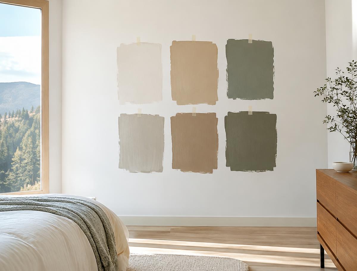
- Use large samples. At least 12 by 12 inches, ideally larger. Painted sample boards you can move around are ideal.
- Test on multiple walls. The wall next to the window and the wall opposite it will look very different.
- Look at different times. Check morning, midday and evening, and with your lamps on at night.
- Compare against fixed finishes. Hold samples next to floors, counters, tile and fireplace stone.
- Don't test on old color. A bold existing color will skew your perception; place samples on a white board.
When to get help
If you've tested a dozen samples and still aren't sure, or you're painting a whole house and want it to feel cohesive, a color consultant can save a lot of time and second-guessing. Our Paint Plan includes a room-by-room plan designed for each room's exposure, mockups on photos of your rooms and swatches placed on your walls. We also offer color consultation across the Denver metro.
For local notes, see our pages on painting in Golden, Evergreen and Genesee, where light and views shape almost every color decision.